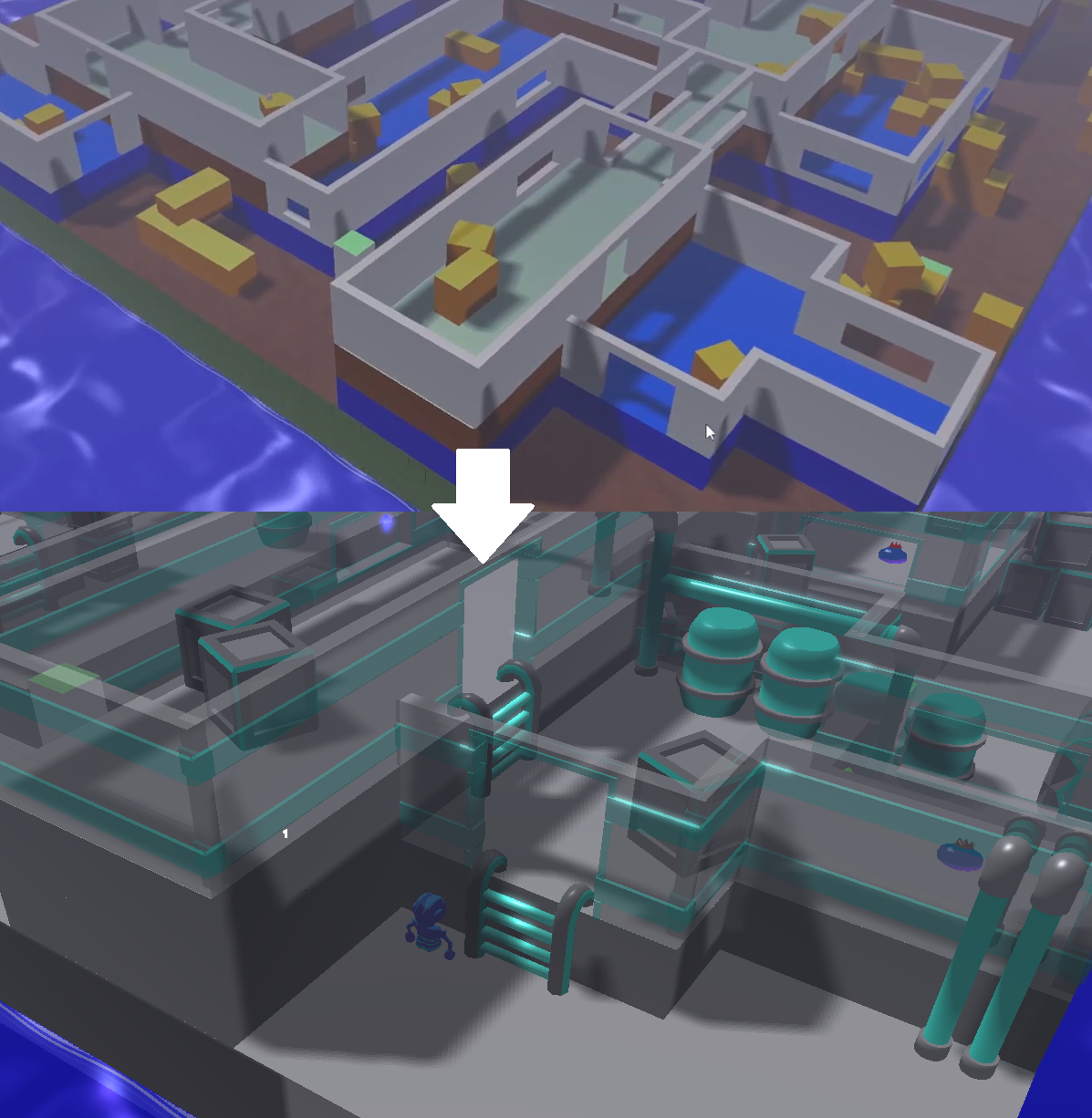
Graphics upgrade
Hi all,
Last week I have been working on a first iteration on the graphics, moving further from the initial blockout used to quickly build the level and test the game mechanics. Since I am currently developing the game alone, I have decided to go for a minimallistic art style, using a color map texture and rather low number of polygons (not low-poly style, but keeping the meshes simple) for all assets. This way, I can focus on gameplay while hopefully achieving a satisfying look. Working with a color map texture has many advantages. On one hand, I can adjust the color palette as desired along the process with minimal effort. On the other hand, it improves a lot the rendering performance since most of the meshes can be renderer in a single draw call. Besides, I can make some of the colors emissive producing a nice visual effect, for instance, on the blue parts of the walls, pipes and stairs.

Working on the graphics also made me realize a lot of interesting things related to gameplay and level design. It is very fun to crawl under tables and hide behid chairs (much more than I though with the blockout version). I will most likely implement a covering mode so that the player can hide better from enemies, but also move within narrow pathes (in width).
There are still a lot of artifacts on the visual side that need to be poolished, but I am quite satisfied with this iteration so I can focus on gameplay. The most important thing now is to have and engaging gameplay and the movement of the player is crucial for this, therefore I might focus on that.
I have posted a video on this topic and explanations on some of the core mechanics. If you are interested you can take a look.
Thanks for reading and I feel free to leave a comment/suggestion. Always appreciated!
Get 3D game project
3D game project
3D game development project using the OpenTK framework
More posts
- Implementing a spawnable attackAug 02, 2024
- New enemy visuals and covering mechanicJul 26, 2024
- Implementing an inventory systemJul 19, 2024
- Prototype level designJul 02, 2024
- Implementing world events and cutscenes systemJun 21, 2024
- How game development process looks like when using a custom-made game engine.Jun 18, 2024
- Testing stealth prototype game mechanicsJun 17, 2024
- Enemies field of view rendering and detectionJun 07, 2024
- Demo of the prototype available to download!May 25, 2024
Leave a comment
Log in with itch.io to leave a comment.